The biggest challenge during this project so far was understanding how to add the gradient overlay. to overcome the issue I asked for help from Mr. Sanderls helpers and they couldn't seem to fix the problem as well. So I explored through the blend modes and I finally found One that showed the gradient overlay as well as the text. That blend mode was subtract btw. Also I couldn't seen to figure how to create my text brush. So I watched and re-watched the tutorial until I could figure it out
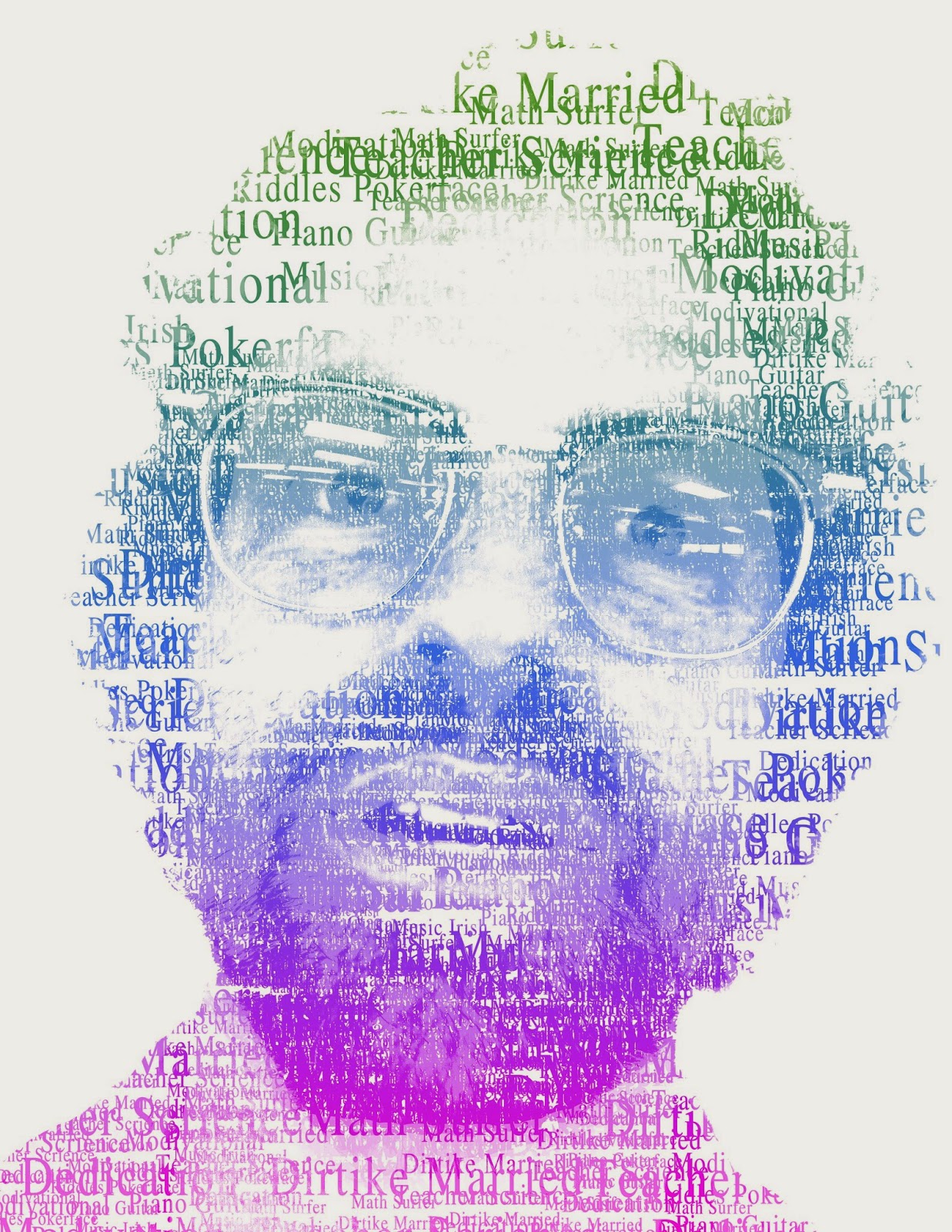
My three examples are of Steve jobs, Mr. Mchugh and Me. What makes each of them different is that they are all done in different methods. Although they are each done using photoshop there were 3 different tutorials we followed. Also they are all of course portraits of different people. My favorite one would have to be the one of Mr. Mchugh, mostly because I like the method and how the text is added to the photo. Here are the links to the other tutorials 1 & 3.


Great colors and creativity.
ReplyDeleteI think your image could be improved if your face had stand out a little bit.
Great, Overall.
The text suits you?
ReplyDeleteIs that really you?
Nice highlights?
I like the colors.
ReplyDeleteMaybe next tie you could make it easier to recognize you.
Nice job!
I just say know that it is all of men
ReplyDeleteI don't think that someone else would know it was you
Like the colors
I like the different colors for different words
ReplyDeleteI think next time you could make an outline of your head
I really like the background, how it has a pattern to it. It adds depth!
I like the crayon like font you used
ReplyDeleteNext time you could fill in your highlights with a different color
I liked the bright colors you used
I really like the bevel and emboss you put on your background. It really stands out.
ReplyDeleteI think you could have put a sort of outline of your face.
I like the spacing of your text.
1. Your font that you chose looks very fun
ReplyDelete2. Maybe you could improve by filling more spaces
3. I can clearly see your text
You can see the words easy
ReplyDeletenext time you could make the words darker
amazing overall picture
I like the colors you used in the words.
ReplyDeleteThe image doesn't look a lot like you.
I like the words you used in the image.
I like the colors you chose
ReplyDeleteCould have made the details on your face stand out more
Great job
I really like how it represent you
ReplyDeleteMaybe next time you can maybe chose different colors
I really like the font you chose
Words are easy to read and see
ReplyDeleteMore text fill in spaces
Nice texture in the backround
I like the words you used!
ReplyDeleteNext time you could have spaced your words better so the viewer could see your actual face.
I like how you used texture in the background.
Interesting background texture.
ReplyDeleteI can't really see you in the portrait.
I like the colors you chose, but I would switch them around so we could see you better.
I like how your font matches your words and your personality!
ReplyDeleteYour highlights are difficult to see and I think it would be cool if you put a pastel color behind your face. The texture is a bit distracting.
I can tell this image is light-hearted and you're a very chill person just by looking at your words.
I really like how you used vey bright and vibrant colors
ReplyDeleteI think you could've added a little more text to the different areas of your face to make more details
I also like how you added the texture to the background it kind of pops out at you a little
I liked the words you chose
ReplyDeleteyou could of made you more visible/recognizable
I also liked the colors you chose
I like the colors you used
ReplyDeleteMaybe next time you could add a background behind your text
I like the background
I like that the words you have really is about you!
ReplyDeleteMaybe add the shadows more dark.
Your good.
I like the mix of colors. Normally colors that aren't in the same color scheme, wouldn't look good, but I think it's nice
ReplyDeleteMaybe next time you could put a little more detail in your features
But nice job overall